
INTRODUCTION TO DESIGN
Week 1
The Bauhaus Legacy

The Bauhaus movement began in 1919 when Walter Gropius founded a school with a vision of bridging the gap between art and industry by combining crafts and fine arts. Prior to the Bauhaus movement, fine arts such as architecture and design were held in higher esteem than craftsmanship (i.e., painting, woodworking, etc.), but Gropius asserted that all crafts, including art, architecture and geometric design, could be brought together and mass-produced. Gropius argued that architecture and design should reflect the new period in history (post World War I), and adapt to the era of the machine. The Bauhaus movement is characterized by economic sensibility, simplicity and a focus on mass production. “Bauhaus” is an inversion of the German term “hausbau,” which means “building house” or house construction.
The first proclamation of the Bauhaus declared: "Archiects, painters, and sculptors must recognize anew the composite character of a building as an entity... Art is not a 'profession.' There is no essential difference between the artist and the craftsman. The artist is an exalted craftsman... Together let us conceive and create the new building of the future, which will embrace architecture and sculpture and painting in one unity and which will rise one day toward heaven from the hands of a million workers like the crystal symbol of a new faith."
This initial statement reflected a nostalgia for the guild systems and collective community spirit that built the great Gothic cathedrals, as well as the socialist thought then current in Germany and throughout much of Europe. Suspicion of this political attitude caused antagonism toward the school among the more conservative elements in Weimar, an antagonism that finally in 1925 drove the Bauhaus to its new home in Dessau.
Under pressure from an increasingly right-wing municipal government, Meyer resigned as director of the Bauhaus in 1930. He was replaced by architect Ludwig Mies van der Rohe. Mies once again reconfigured the curriculum, with an increased emphasis on architecture. Lily Reich, who collaborated with Mies on a number of his private commissions, assumed control of the new interior design department. Other departments included weaving, photography, the fine arts, and building. The increasingly unstable political situation in Germany, combined with the perilous financial condition of the Bauhaus, caused Mies to relocate the school to Berlin in 1930, where it operated on a reduced scale. He ultimately shuttered the Bauhaus in 1933.
During the turbulent and often dangerous years of World War II, many of the key figures of the Bauhaus emigrated to the United States, where their work and their teaching philosophies influenced generations of young architects and designers. Marcel Breuer and Joseph Albers taught at Yale, Walter Gropius went to Harvard, and Moholy-Nagy established the New Bauhaus in Chicago in 1937.

Week 2
Point, Line, Plane

Differentiating types of line quality
The definition of Line. Quality and Variety of Line
Line exploration of various media
The use of text as line


Week 3
Rhythm and Balance


Week 9
As a social value, transparency suggests clarity and directness. The idea of "transparent government" promoter processes that are open and understandable to the public, not hidden behind closed doors. Yet in design, transparency is often used not for the purposes of clarity, but to create dense, layered imagery built from veils of color and texture.
Any surface in the physical world is more or less transparent or opaque: a piece of wood has 100 percent
opacity, while a room full of air has nearly zero. Image-editing software allows designers to adjust the opacity of any still or moving picture. Software lets you see through wood, or make air into a solid wall.
Transparency becomes an active design element when its value is somewhere between zero and 100 percent. In this chapter, we assume that a "transparent" image or surface is, generally, opaque to some degree. Indeed, you will discover that a surface built out of completely opaque elements can function in a transparent way.
Transparency and layers are related phenomena. A transparent square of color appears merely pale or faded until it passes over another shape or surface, allowing a second image to show through itself. A viewer thus perceives the transparency of one plane in relation to a second one. What is in front, and what is behind? What dominates, and what recedes?
Video and animation programs allow transparency to change over time. A fade is created by making a clip gradually become transparent. Dissolves occur when one clip fades out (becoming transparent) while a second clip fades in (becoming opaque)
Transparency is fascinating and seductive principle. How can it be used to build meaningful images? Transparency can serve to emphasize values of directness and clarity through adjustments and juxtapositions that maintain the wholeness or legibility of elements. Transparency also can serve to build complexity by allowing layers to mix and merge together. Transparency can be used thematically to combine or contrast ideas, linking levels of content. When used in a conscious and deliberate way. transparency contributes to the meaning and visual intrigue of a work of design.


Week 10
Exam 2
Assessing student learning from Weeks 5 through 9
Every design problem is completed within a set of constraints or limitations. These limits can be as broad as"design a logo," as generic as "print on standard letter paper," or as narrow as "arrange six circles in a square space"
Modularity is a special kind of constraint. A module is a fixed element used within a larger system or structure. For example, a pixel is a module that builds a digital image. A pixel is so small, we rarely stop to notice it, but when designers create pixel-based typefaces, they use a grid of pixels to invent letterforms that are consistent from one to the next while giving each one a distinctive shape.
A nine-by-nine grid of pixels can yield an infinite number of different typefaces. Building materials–from bricks to lumber to plumbing parts–are manufactured in standard sizes. By working with ready–made materials, an architect helps control construction costs while also streamlining the design process.
Designers are constantly making decisions about size, color, placement, proportion, relationships, and materials as well as about subject matter, style, and imagery. Sometimes, the desicion-making process can be so overwhelming, it's hard to know how to begin and when to stop. When a few factors are determined in advance, the designer is free to think about other parts of the problem. A well-defined constraint can free up the thought process by taking some decisions off the table.

Week 11


Week 12
Describing symbolic meaning, artist’s imagery, customs, values or text incorporated in the work of art.
Form and Content
Images that emphasize content and aesthetics, and visual perception
Week 13
Week 14
Exam 3
Applying the different techniques learned throughout the course and incorporate them into a Final Project portfolio.
Edit Final Project Portfolio
Week 15
Portfolio Presentation.
Week 1
The Bauhaus Legacy

The Bauhaus movement began in 1919 when Walter Gropius founded a school with a vision of bridging the gap between art and industry by combining crafts and fine arts. Prior to the Bauhaus movement, fine arts such as architecture and design were held in higher esteem than craftsmanship (i.e., painting, woodworking, etc.), but Gropius asserted that all crafts, including art, architecture and geometric design, could be brought together and mass-produced. Gropius argued that architecture and design should reflect the new period in history (post World War I), and adapt to the era of the machine. The Bauhaus movement is characterized by economic sensibility, simplicity and a focus on mass production. “Bauhaus” is an inversion of the German term “hausbau,” which means “building house” or house construction.
The first proclamation of the Bauhaus declared: "Archiects, painters, and sculptors must recognize anew the composite character of a building as an entity... Art is not a 'profession.' There is no essential difference between the artist and the craftsman. The artist is an exalted craftsman... Together let us conceive and create the new building of the future, which will embrace architecture and sculpture and painting in one unity and which will rise one day toward heaven from the hands of a million workers like the crystal symbol of a new faith."
This initial statement reflected a nostalgia for the guild systems and collective community spirit that built the great Gothic cathedrals, as well as the socialist thought then current in Germany and throughout much of Europe. Suspicion of this political attitude caused antagonism toward the school among the more conservative elements in Weimar, an antagonism that finally in 1925 drove the Bauhaus to its new home in Dessau.
Under pressure from an increasingly right-wing municipal government, Meyer resigned as director of the Bauhaus in 1930. He was replaced by architect Ludwig Mies van der Rohe. Mies once again reconfigured the curriculum, with an increased emphasis on architecture. Lily Reich, who collaborated with Mies on a number of his private commissions, assumed control of the new interior design department. Other departments included weaving, photography, the fine arts, and building. The increasingly unstable political situation in Germany, combined with the perilous financial condition of the Bauhaus, caused Mies to relocate the school to Berlin in 1930, where it operated on a reduced scale. He ultimately shuttered the Bauhaus in 1933.
During the turbulent and often dangerous years of World War II, many of the key figures of the Bauhaus emigrated to the United States, where their work and their teaching philosophies influenced generations of young architects and designers. Marcel Breuer and Joseph Albers taught at Yale, Walter Gropius went to Harvard, and Moholy-Nagy established the New Bauhaus in Chicago in 1937.

Week 2
Point, Line, Plane

Point, line, and plane are the building blocks of design. From these elements, designers create images, icons, textures, patterns, diagrams, animations, and typographic systems.
Point A point marks a position in space. In pure geometric terms, a point is a pair of x, y coordinates. It has no mass at all. Graphically, however, a point takes form as a dot, a visible mark. A point can be an insignificant fleck of matter or a concentrated locus of power. It can penetrate like a bullet, pierce like a nail, or pucker like a kiss. A mass of points becomes texture, shape, or plane. Tiny points of varying size create shades of gray.
Line A line is an infinite series of points. Understood geometrically, a line has length, but no breadth. A line is the connection between two points, or it is the path of a moving point. A line can be a positive mark or a negative gap. Lines appear at the edges of objects and where two planes meet. Graphically, lines exist in many weights; the thickness and texture as well as the path of the mark determine its visual presence. Lines are drawn with a pen, pencil, brush, mouse, or digital code. They can be straight or curved, continuous or broken. When a line reaches a certain thickness, it becomes a plane. Lines multiply to describe volumes, planes, and textures.
Plane A plane is a flat surface extending in height and width. A plane is the path of a moving line; it is a line with breadth. A line closes to become a shape, a bounded plane. Shapes are planes with edges. In vector–based software, every shape consists of line and fill. A plane can be parallel to the
picture surface, or it can skew and recede into space. Ceilings, walls, floors, and windows are physical planes. A plane can be solid or perforated, opaque or transparent, textured or smooth.
Differentiating types of line quality
The definition of Line. Quality and Variety of Line
Line exploration of various media
The use of text as line


Week 3
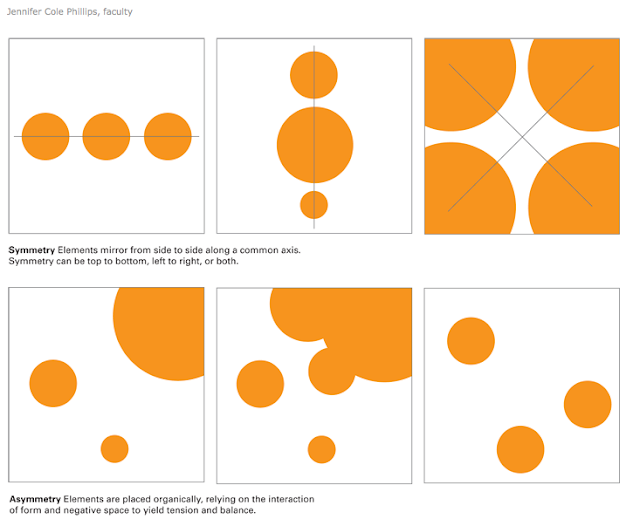
Rhythm and Balance
Balance is a fundamental human condition: we require physical balance to stand upright and walk; we seek balance among the many facets of our personal and professional lives; the world struggles for balance of power.
In design, balance anchors and activates elements in space. Relationships among elements on the page or screen remind us of physical relationships. Visual balance
occurs when the weight of one or more things is distributed evenly or proportionately in space. Like arranging furniture in a room, we move components around until the balance of form and space feels right. Large objects are a counterpoint to smaller ones; dark objects to lighter ones.
A symmetrical design is inherently stable. Yet ba- lance need not be static. A tightrope walker achieves balance while traversing a precarious line in space, continually shifting her weight while staying in motion. Designers employ contrasting size, texture, value, color, and shape to offset or emphasize the weight of an object and achieve the acrobat's dynamic sense of balance.
Rhythm is a strong, regular, repeated pattern: the beating of drums, the patter of rain, the falling of footsteps. Speech, music, and dance all employ rhythm
to express form over time. Designers use rhythm to construct single images as well as to create books, magazines, and motion graphics that have duration and sequence. Designers seek rhythms that are punctuated with change and variation.


Designing a value graduation scale of color.
Value
Value Scale
Value to create spatial relationships
Black and white as color
Week 4
Scale is Relative A graphic element can appear larger or smaller depending on the size, placement, and color of the elements around it. When elements are all the same size, the design feels flat. Contrast in size can create a sense of tension as well as a feeling of depth and movement. Small shapes tend to recede; large ones move forward.

Week 5
Exam 1
enter - exit
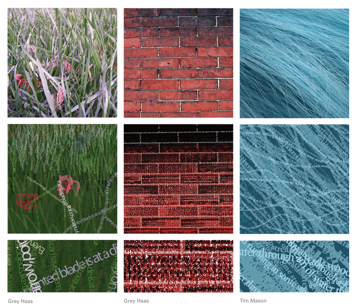
Texture is the tactile grain of surfaces and substances. In design, texture is both physical and virtual. Textures include the literal surface employed in the making of a printed piece or physical object as well as the optical appearance of that surface. Paper can be rough or smooth, fabric can be nubby or fine, and packaging material can be glossy or matte. Physical textures affect how a piece feels to the hand, but they also affect how it looks. A smooth or glossy or matte. Physical textures affect how a piece feels to the hand, but they also affect how it looks. A smooth or glossy surface, for example, reflects light differently than a soft or pebbly one.
Many of the textures that designers manipulate are not physically experienced by the viewer at all, but exist as optical effect and representation. Texture adds detail to an image, providing an overall surface quality as well as rewarding the eye when viewed up close.
As in life, the beauty of texture in design often lies in its poignant juxtaposition or contrast: prickly/soft, sticky/dry, fuzzy/smooth, and so on. By placing one texture in relation to its opposite, or a smart counterpart, the designer can amplify the unique formal properties of each one.
Designers generate textures by hand, camera, computer, and code. Textures are abstract and concrete, and they can be captured, sliced, built, and brushed. Texture has a genuine, visceral, wholly seductive capacity to reel us in and hold us.


Value
Value Scale
Value to create spatial relationships
Black and white as color
Week 4
Scale is Relative A graphic element can appear larger or smaller depending on the size, placement, and color of the elements around it. When elements are all the same size, the design feels flat. Contrast in size can create a sense of tension as well as a feeling of depth and movement. Small shapes tend to recede; large ones move forward.

Week 5
Exam 1
enter - exit
Texture is the tactile grain of surfaces and substances. In design, texture is both physical and virtual. Textures include the literal surface employed in the making of a printed piece or physical object as well as the optical appearance of that surface. Paper can be rough or smooth, fabric can be nubby or fine, and packaging material can be glossy or matte. Physical textures affect how a piece feels to the hand, but they also affect how it looks. A smooth or glossy or matte. Physical textures affect how a piece feels to the hand, but they also affect how it looks. A smooth or glossy surface, for example, reflects light differently than a soft or pebbly one.
Many of the textures that designers manipulate are not physically experienced by the viewer at all, but exist as optical effect and representation. Texture adds detail to an image, providing an overall surface quality as well as rewarding the eye when viewed up close.
As in life, the beauty of texture in design often lies in its poignant juxtaposition or contrast: prickly/soft, sticky/dry, fuzzy/smooth, and so on. By placing one texture in relation to its opposite, or a smart counterpart, the designer can amplify the unique formal properties of each one.
Designers generate textures by hand, camera, computer, and code. Textures are abstract and concrete, and they can be captured, sliced, built, and brushed. Texture has a genuine, visceral, wholly seductive capacity to reel us in and hold us.

Week 6
To identify the fore, middle, and background as a landscape or deep space in a work of art.
To use texture as a form of design and identify the relationship of types of textures.
Positive/ Negative Space Texture
Figure and Ground (Object and its surrounding environment.)
Figure/ground relationships shape visual perception. A figure (form) is always seen in relation to what surrounds it (ground, or background)–letters to a page, a building to its site, a sculpture to the space within it and around it, the subject of a photograph to its setting and so on. A black shape on a black field is not visible; without separation and contrast, form disappears.
People are accustomed to seeing the background as passive and unimportant relation to a dominant subject.Yet visual artists quickly become attuned to the spaces around and between elements, discovering their power to shape experience and become active forms in their own right.
Graphic Designers often seek a balance between figure and ground, using this relationship to bring energy and order to form and space. They build contrasts between form and counterform in order to construct icons, illustrations,logos,compositions, and patterns that stimulate the eye. Creating figure/ground tension or ambiguity adds visual energy to an image or mark. Even subtle ambiguity can invigorate the end result and shift its direction and impact.
Figure/ground also known as positive and negative space, is at work in all facets of graphic design. In the design of logotypes and symbols, the distillation of complex meaning into simplified but significant form thrives on the taut reciprocity of figure and ground. In posters, layouts, and screen designs, what is left out frames and balances what is built in. Similarly, in time based media,including multipage books, the insertion and distribution of space across time affects perception and pacing
The ability to create and evaluate effective figure/ground tension is an essential skill for graphic designers.Train your eye to carve out white space as you compose with forms. Learn to massage the positive and negative areas as you adjust the scale of images and typography. Look at the shapes each element makes and see if the edges frame a void that is equally appealing. Notice how as the value of a text block becomes darker, its shape becomes more defined when composed with other elements.


Week 7
Hierarchy is the order of importance within a social group (such as the regiments of an army) or in a body of text (such as the sections and subsections of a book). Hierarchical order exists in nearly everything we know, including the family unit, the workplace, politics, and religion. Indeed, the ranking of order defines who we are as a culture.
Hierarchy is expressed through naming systems: general, colonel, corporal, private, and so on. Hierarchy is also conveyed visually, through variations in scale, value, color, spacing, placement, and other signals.
Like fashion, graphic design cycles through periods of structure and chaos, ornament and austerity. A designer's approach to visual hierarchy reflects his or her personal style, methodology, and training as well as the zeitgeist of the period. Hierarchy can be simple or complex, rigorous or loose, flat or highly articulated. Regardless of approach, hierarchy employs clear marks of separation to signal a change from one level to another. As in music, the ability to articulate variation in tone, pitch, and melody in design requires careful delineation.
In interaction design, menus,texts, and images can be given visual order through placement and consistent styling, but the user often controls the order in which information is accessed. Unlike a linear book, interactive spaces feature multiple links and navigation options. Cascading Style Sheets (CSS) articulate the structure of a document separately from its presentation so that information can be automatically reconfigured for different output devices, from desktop computer screens to mobile phones, PDAs, kiosks, and more. A different visual hierarchy might be used in each instance.
The average computer desktop supports a complex hierarchy of icons, applications, folders, menus, images, and palettes–empowering users, as never before, to arrange, access, edit, and order vast amounts of information–all managed through a flexible hierarchy controlled and customized by the user.
As technology allows ever greater access to information, the ability of the designer to distill and make sense of the data glut gains increasing value.


Week 8
Layers are simultaneous, over-lapping components of an image or sequence. They are at work in countless media software programs, from Photoshop and Illustrator to audio, video, and animation tools, where multiple layers of image and sound (tracks) unfold in time. Maps use overlapping layers to associate and separate different levels of data, allowing each level to contribute to the whole while maintaining its own identity. Printing techniques use multiple layers of ink to build a single image. Although the layered archeology of the printed page or digital file tends to disappear in the final piece, experimental work often uncovers visual possibilities by exposing layers.
Layers are simultaneous, over-lapping components of an image or sequence. They are at work in countless media software programs, from Photoshop and Illustrator to audio, video, and animation tools, where multiple layers of image and sound (tracks) unfold in time. Maps use overlapping layers to associate and separate different levels of data, allowing each level to contribute to the whole while maintaining its own identity. Printing techniques use multiple layers of ink to build a single image. Although the layered archeology of the printed page or digital file tends to disappear in the final piece, experimental work often uncovers visual possibilities by exposing layers.

Week 9
As a social value, transparency suggests clarity and directness. The idea of "transparent government" promoter processes that are open and understandable to the public, not hidden behind closed doors. Yet in design, transparency is often used not for the purposes of clarity, but to create dense, layered imagery built from veils of color and texture.
Any surface in the physical world is more or less transparent or opaque: a piece of wood has 100 percent
opacity, while a room full of air has nearly zero. Image-editing software allows designers to adjust the opacity of any still or moving picture. Software lets you see through wood, or make air into a solid wall.
Transparency becomes an active design element when its value is somewhere between zero and 100 percent. In this chapter, we assume that a "transparent" image or surface is, generally, opaque to some degree. Indeed, you will discover that a surface built out of completely opaque elements can function in a transparent way.
Transparency and layers are related phenomena. A transparent square of color appears merely pale or faded until it passes over another shape or surface, allowing a second image to show through itself. A viewer thus perceives the transparency of one plane in relation to a second one. What is in front, and what is behind? What dominates, and what recedes?
Video and animation programs allow transparency to change over time. A fade is created by making a clip gradually become transparent. Dissolves occur when one clip fades out (becoming transparent) while a second clip fades in (becoming opaque)
Transparency is fascinating and seductive principle. How can it be used to build meaningful images? Transparency can serve to emphasize values of directness and clarity through adjustments and juxtapositions that maintain the wholeness or legibility of elements. Transparency also can serve to build complexity by allowing layers to mix and merge together. Transparency can be used thematically to combine or contrast ideas, linking levels of content. When used in a conscious and deliberate way. transparency contributes to the meaning and visual intrigue of a work of design.


Week 10
Exam 2
Assessing student learning from Weeks 5 through 9
Every design problem is completed within a set of constraints or limitations. These limits can be as broad as"design a logo," as generic as "print on standard letter paper," or as narrow as "arrange six circles in a square space"
Modularity is a special kind of constraint. A module is a fixed element used within a larger system or structure. For example, a pixel is a module that builds a digital image. A pixel is so small, we rarely stop to notice it, but when designers create pixel-based typefaces, they use a grid of pixels to invent letterforms that are consistent from one to the next while giving each one a distinctive shape.
A nine-by-nine grid of pixels can yield an infinite number of different typefaces. Building materials–from bricks to lumber to plumbing parts–are manufactured in standard sizes. By working with ready–made materials, an architect helps control construction costs while also streamlining the design process.
Designers are constantly making decisions about size, color, placement, proportion, relationships, and materials as well as about subject matter, style, and imagery. Sometimes, the desicion-making process can be so overwhelming, it's hard to know how to begin and when to stop. When a few factors are determined in advance, the designer is free to think about other parts of the problem. A well-defined constraint can free up the thought process by taking some decisions off the table.

Week 11
Designers create rules as well as finished pieces. A magazine designer, for example, works with a grid, and a typographic hierarchy that is interpreted in different ways, page after page, issue after issue. If the rules are well planned, other designers will be able to interpret them to produce their own unique and unexpected layouts. Rules create a framework for design without determining the end results.
Style sheets employed in print and web publishing (CSS) are rules for displaying the different parts of a document. By adjusting a style sheet, the designer can change the appearance of an entire book or website. Style sheets are used to reconfigure a single body of content for output in different media, from printed pages to the screen of a mobile phone.
Rules can be used to generate form as well as organize content. In the 1920s, the Bauhaus artist and designer Laszlo Moholy–Nagy created a painting by telephoning a set of instructions to a sign painter. In the 1960s, the minimalist artist Sol Le Witt created drawings based on simple instructions; the drawing could be executed on a wall or other surface anywhere in the world by following the directions. Complex webs of lines often resulted from seemingly simple verbal instructions.
Designing rules and instructions is an intrinsic part of the design process. Increasingly, designers are asked to create systems that other people will implement and that will change over time. This chapter looks at ways to use rule–based processes to generate unexpected visual results.


Week 12
Describing symbolic meaning, artist’s imagery, customs, values or text incorporated in the work of art.
Form and Content
Images that emphasize content and aesthetics, and visual perception
Week 13
Identifying major themes in art and recreate a piece from a major artist.
Images and Themes
Figurative, Still- life and Landscape imagery
Practical work on workshop: Figurative composition.
Week 14
Exam 3
Applying the different techniques learned throughout the course and incorporate them into a Final Project portfolio.
Edit Final Project Portfolio
Week 15
Portfolio Presentation.
No comments:
Post a Comment